
Stay Cooler on Vacation: Science Backed Colors for Hot Weather

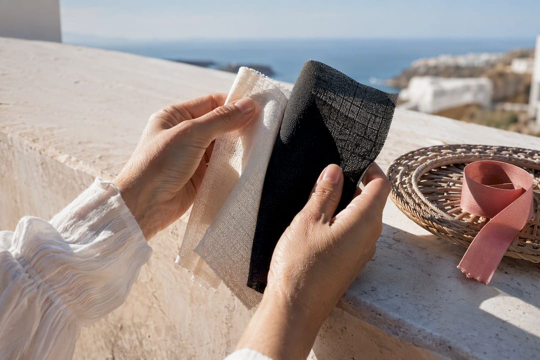
White and other very light colors, including pale yellow, soft pastels, and light blue, stay coolest in direct sun because they reflect the most sunlight back off the fabric surface. Dark shades like black and deep navy absorb far more of that same light and heat up considerably faster. Color is only part of the equation, though. Fit, fabric weight, and airflow can matter just as much as the shade you pick, a point covered in the practical breakdown below.
TL;DR:
Light colors such as white, pastels, and light gray reflect more sunlight and stay cooler under direct sun, while dark shades like black absorb more heat.
Fabric weight, fit, and airflow significantly influence comfort, with loose and breathable clothing often offsetting the heat absorption of darker shades.
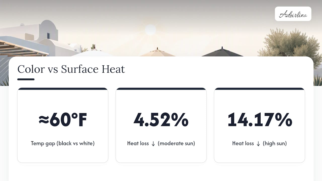
In prolonged sun exposure, avoid dark colors like black and navy, which can be about 60°F hotter after five minutes compared to white fabrics.
Clothing with high albedo, such as white linen or cotton, can lower surface temperatures by up to 60°F compared to dark fabrics in five minutes of direct sunlight.
The choice of color should be combined with activity and environmental context, favoring lighter tones for outdoor heat and darker or medium tones for shaded or controlled environments.
Table of Contents
Best Colors for Hot Weather That Reflect the Most Sunlight
Choosing colors for hot weather starts with a basic physics lesson: lighter colors reflect more visible light, while darker ones absorb it and convert it to heat at the fabric surface. That single principle explains most of what follows.
White. It reflects the broadest range of visible light and consistently measures the lowest surface temperature in side-by-side fabric tests, making it the benchmark for anyone dressing for full sun.
Pale yellow and cream. These sit close behind white in reflectivity and tend to be more flattering against a wider range of skin tones, which makes them an easy substitute when stark white feels too clinical.
Pastels. Mint, lavender, soft pink, and sky blue all reflect light efficiently while giving you far more room to play with pattern and personality than a plain white shirt or dress allows.
Light blue and light gray. Both are dependable, everyday-practical choices that hide travel wrinkles and light dust better than pure white, without giving up much thermal performance.
Medium red and medium turquoise. Surprisingly, these mid-tone shades often reflect light effectively and can be nearly as cool as white in comparative testing, outperforming what you’d expect for anything but pale pastels, and easily beating deep navy or forest green.
The practical takeaway: you are not limited to a wardrobe of plain white. Pastels and select medium tones for summer heat give you real styling range while keeping most of the thermal benefit.
Colors to Avoid and When That Matters
Black, dark green, dark navy, and deep burgundy consistently rank as the warmest fabric colors in direct-sun testing. A Japanese research team measured the difference directly: in a five-minute exposure test, black fabric reached surface temperatures about 60°F higher than white, with dark green close behind.
The mechanism is straightforward. Dark pigments absorb more visible and near-infrared radiation, and that absorbed energy raises the surface temperature of the fabric, which then transfers heat toward the body.
That doesn’t make dark colors off-limits everywhere.
Loose, airy linen in a dark shade can still breathe well because the fabric barely touches the skin.
Shaded settings, evening events, and air-conditioned interiors neutralize most of the absorption problem.
The real rule of thumb: avoid deep, dark shades specifically for prolonged direct-sun exposure, whether you’re walking a beach boardwalk or standing at an outdoor market at noon.
The Science: How Color Changes Surface Temperature
The mechanism behind all of this is albedo, the fraction of light a surface reflects rather than absorbs. Lighter colors have higher albedo, so more sunlight bounces off before it converts to heat. Darker colors have lower albedo, so more of that same light gets trapped and turned into warmth at the fabric surface.
Measured difference: In direct sun, surface-temperature testing has recorded a gap of roughly 60°F between black and white fabric after just five minutes of exposure, one of the clearest demonstrations of how much color alone can shift comfort.
Controlled research backs this up from multiple directions. One experimental study found that dark clothing reduced total heat loss by 4.52% at moderate solar intensity and by as much as 14.17% at higher intensity compared with light-colored clothing, and subjects wearing dark garments consistently reported feeling warmer. Separate thermal manikin testing, using an outdoor rig built to isolate radiative heat gain, confirmed that clothing color is the dominant factor in how much radiant heat a garment absorbs under direct sun, with light-colored garments substantially outperforming dark ones.
None of this happens in a vacuum, though. Manikin rigs and lab chambers strip out the variables of a real body moving, sweating, and generating its own heat, plus wind, humidity, and how loosely a garment sits against the skin. That’s why the next section matters just as much as the color chart above.
When Color Matters Less: Fit, Fabric, and Airflow
Color sets the baseline, but airflow can override it entirely. Traditional Bedouin robes are a case in point: they’re often dark, yet loose, billowy garments create a chimney-like airflow that pulls hot air up and away from the skin, keeping the wearer comfortable despite the dark fabric absorbing plenty of sunlight.
That airflow effect is why a well-cut, loose linen dress in a darker tone can sometimes feel cooler than a tight white synthetic top.
Fabric choice deserves equal weight:
Cotton and linen breathe well and let moisture evaporate quickly, which is what actually cools skin.
Viscose drapes loosely and adds a similar airy quality with a softer hand feel.
Polyester and nylon often trap heat and moisture against the skin once they get damp, even in a light color.
Textured weaves like seersucker or piqué lift fabric slightly off the skin, creating tiny air channels that improve circulation.
Headgear follows the same rules as clothing. Manikin testing recommends light-colored hats with a thicker crown for reducing heat gain at the head, since a thin, dark brim offers almost no insulation against direct overhead sun.
Pro Tip: When you’re torn between two colors, check the weave and fit first. A loose, breathable weave in a medium tone will often keep you cooler than a tight, non-breathable garment in white.
How to Pick Colors for Different Activities and Skin Tones
Matching color to activity, not just to a general “summer palette,” gets you the best comfort return.
Full-sun outdoor activities. Beach days, hikes, festivals: lean on white, pale yellow, or pastels in cotton or linen. This is where the reflectivity gap matters most.
Mixed indoor/outdoor days. Sightseeing, shopping, city walking: light gray or light blue give you flexibility without looking out of place indoors or out.
Evening and dress occasions. Dinner, a night out: medium tones like coral, medium red, or turquoise perform better thermally than you’d guess, and they read as more intentional than washed-out pastels under evening light.
Skin-tone swaps. If stark white feels harsh against your complexion, cream, soft peach, or pale sky blue deliver nearly identical cooling benefits with a warmer, more flattering cast.
The goal isn’t to force every outfit into white. It’s picking from a band of light-to-medium colors for summer heat that suits the setting and still does the thermal work.
Why Certain Colors Feel Cooler, Even Beyond the Science
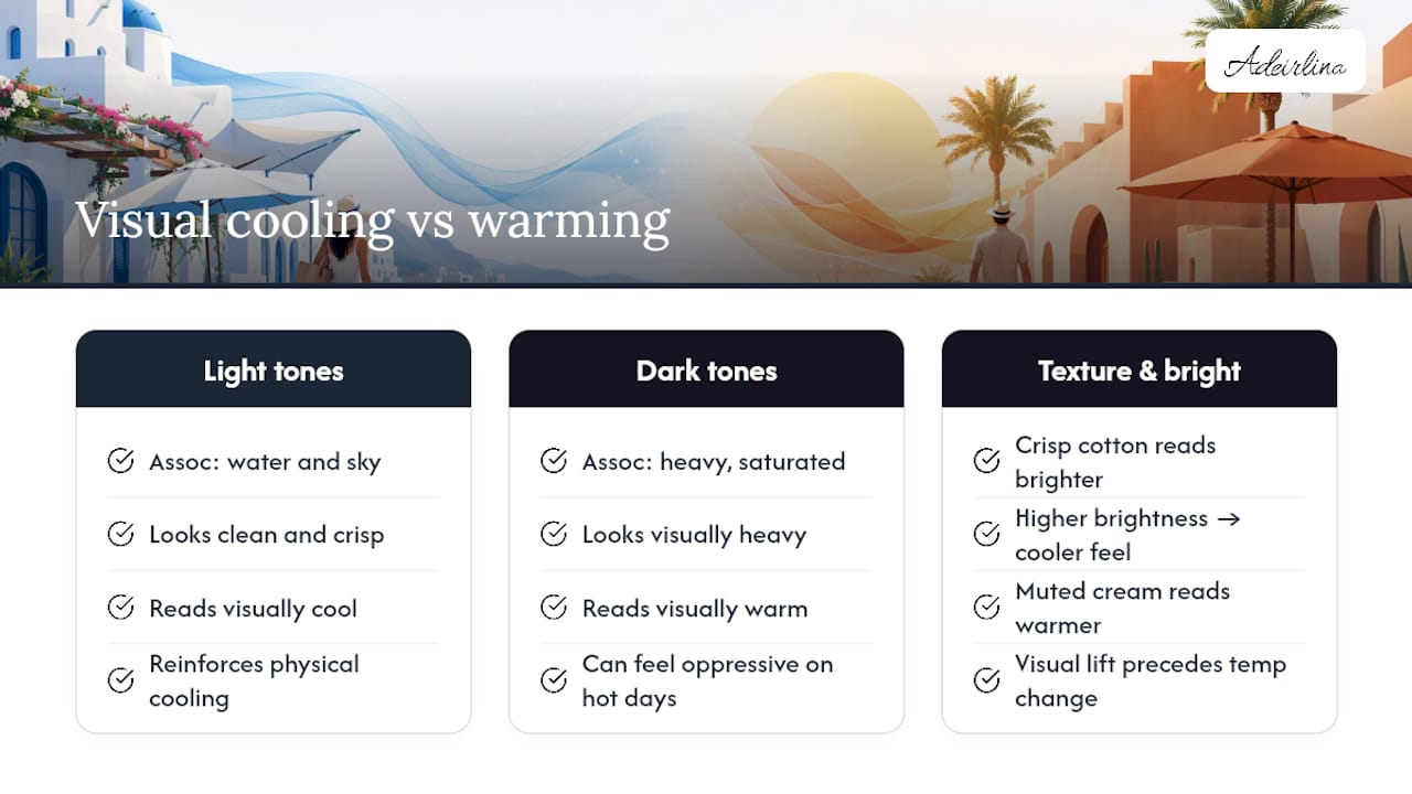
Color affects comfort on a psychological level, not just a thermal one. Blues and light tones tend to read visually as “cool” because of long-standing associations with water, sky, and shade, and that mental association can shape how relaxed or overheated a person feels before body temperature even changes. White carries its own psychological weight: it looks clean, crisp, and lighter in a literal sense, reinforcing the physical cooling it provides.
There’s a flip side. Deep, saturated colors like burgundy or dark green can feel visually “heavy” even indoors, which may make a hot day feel more oppressive regardless of the actual temperature. This is one reason resort and warm-climate fashion leans so heavily on white, pastel, and light-blue palettes. The visual cue and the physical benefit reinforce each other.
Texture and brightness play into this too. A crisp white cotton dress photographs and feels brighter than a muted cream in the same cut, and that visual lift often translates into a subjective sense of feeling cooler and more energized, even on an equally hot afternoon. It’s a small effect, but it’s part of why light colors dominate summer fashion far beyond what the surface-temperature numbers alone would predict.
Cultural Roots of Light Colors in Hot Climates
Warm-climate cultures arrived at light-colored clothing long before anyone measured albedo in a lab. White linen and cotton have been staples across the Mediterranean, North Africa, and the Middle East for generations, worn for the same reason modern travelers reach for it now: it manages heat well and it’s easy to keep clean-looking in bright sun.
Not every hot-climate tradition points the same direction, though. Desert-dwelling communities, including Bedouin groups, have long favored dark, loose robes, proof that airflow and fit can offset color choice entirely in the right garment. Meanwhile, tropical regions across Southeast Asia and Latin America built vibrant color into everyday warm-weather dress, using bright pastels and saturated hues as much for cultural identity and celebration as for temperature management.
The common thread across these traditions isn’t a single “correct” color. It’s a consistent preference for lightweight, breathable fabric paired with a garment silhouette suited to the climate. Color for hot weather is really a layer on top of that older, more universal principle, one that shows up in a white linen shirt on a Greek island and a pastel cotton dress at a beach town halfway around the world.
Designing for the Science: A Note From Adeirlina
Some brands build around this research, not around trends. Internal fabric testing on select dresses has shown a 2°C comfort benefit tied to cut and weave, not color alone, which tracks with everything the studies above show about fit mattering as much as shade.
Picture one set doing the work of five outfits: worn loose through a morning market, tied differently for photos at golden hour, loosened further for an afternoon nap, then styled up for a sunset dinner and a night of dancing. That’s the standard a breathable summer set should meet.
— Naomi
Meet the Carnival Crop-Top Set, Built for Every Hour of Vacation
Adeirlina’s Carnival Crop-Top set is soft, breathable, and made to move with you from sunrise markets to sunset dinners.
[
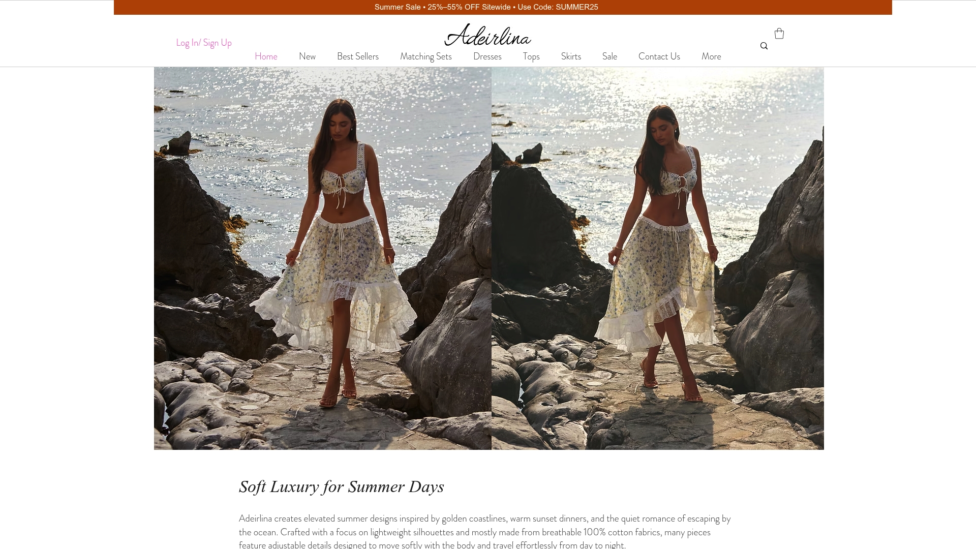
This is the piece that quietly took over Instagram, worn and reshared by everyday customers, influencers, and celebrities across the globe. Part of the appeal is how little effort it takes: wear it loose for a morning market walk and photos, loosen the fit for an afternoon nap, then dress it up for a romantic sunset dinner or a night of dancing, all without changing outfits. It comes in a wide range of colors, so picking a shade for your next destination, mood, or occasion is half the fun. If you’re ready to build a lighter, easier vacation wardrobe, shop the Carnival Crop-top set and pick your color.
Sources
FAQ
What Colors Are Best in Hot Weather?
White, pale yellow, and pastels like mint, lavender, and sky blue reflect the most sunlight and stay coolest in direct sun. Light gray and light blue are close, practical runners-up for everyday wear.
What Is the Best Color to Wear in Hot Weather?
White measures the lowest surface temperature in testing and remains the single most reliable choice for direct-sun exposure. If white isn’t flattering or practical, pale yellow or a light pastel gets you nearly the same benefit.
What Colors Should You Avoid in Heat?
Black, dark green, dark navy, and deep burgundy absorb the most heat and should be avoided for prolonged direct-sun exposure. They’re less of a concern in shade, air-conditioned spaces, or when worn in a loose, breathable cut.
What Is the Best Color to Reduce Heat?
White reduces heat absorption most effectively because it reflects the broadest range of visible light rather than converting it to surface heat. Pale yellow and light pastels come close behind, offering nearly the same reduction with more styling variety.
Recommended